 636 Views
  4 min read
There’s a real need for Health Tech startups to shake up the industry. Your brand new solution might revolutionize the industry, but have you considered user experience? Your app might strive to simplify patient-doctor meetings, but they won’t use it if the experience is poor. That’s why it is important to develop a health digital marketing strategy. Here are some health digital marketing techniques to improve your customer’s experience and help achieve your web goals:
Websites or apps that presents new medical devices or software should be simple and intuitive to use. Don’t overwhelm patients with huge amounts of data. Your customers don’t have the time to read through an essay describing your technology. Use your health digital marketing strategy to communicate main ideas efficiently to guide leads to look for more information. Either on your blog or within the free content you offer to download on your website.
 |
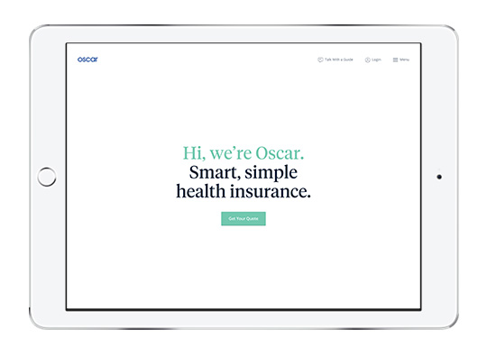
Accessing Health Insurance is complicated. That’s the statement Oscar hopes to challenge with a user-friendly app and a clean website< You find many Call-to-actions (“Get a quote”, “Search doctors and drugs”) and a simple description of what the app can do for patients. |
Understand Patient needs and challenges need to create the best user experience possible. According to patient experience consultant Richard Anderson, Peer-to-peer healthcare, ePatient advocacy and the quantified self movement are examples of participatory design that all aim for “badly needed healthcare revolution.”
Let’s say you wanted to learn piano. You arrive to the classroom motivated. The piano is there, waiting for you to play it. But then a giant textbook of music theory is placed in front of you, and that was to be your first lesson. It’s likely that you won’t return to this class and maybe even quit piano for good. You don’t want your leads to feel this frustration when they arrive on your website or your app. As a Health Tech company you have to prove your reliability. But rather than using medical jargon, take into account a very important factor – your App must have a bedside manner. Knowing that users never return on 90% of the health apps they download, this should ensure that your app stands with the remaining 10%.
Every patient is different, from his blood type to the conditions that run in his family. Yet when a doctor sees a patient, he will ask the same generic questions to try to isolate a specific problem. When it comes to designing the website or the app you don’t want to over customize it. Excess customization makes it difficult for new users to get started.
 |
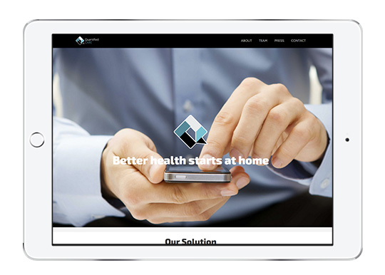
Quantified Care connects patients and caregivers while adapting to their needs. Patients uses the app to keep track of their data while caregivers uses the web portal to identify patients. The app’s experience is streamlined so all customers follow the same process for exchanging and organizing data. |
Our Director Edmund Zaloga, who taught typography and communication design for many years says that
“Typography is a fundamental part of the user experience as it’s one of the basic forms of visual communication. Great type has the power to engage us and channel ideas.”
So if you want to keep your website easy on the eyes, you should use sans serif fonts with a type size of at least 16pts. Choose spacing at least 1.4 between lines of text and make headlines and subheads smaller as the user scrolls down your web page. Lines of text and paragraphs need to stay short and make the most out of bulleted lists. Websites that communicate better, use well designed elements, and create an engaging and mobile-friendly experience, promote strong relationships with customers. We hope these health digital marketing techniques provided you with a better understanding of UX Design. Go forth and increase your customer conversion rates, and delight customers Health Tech!
