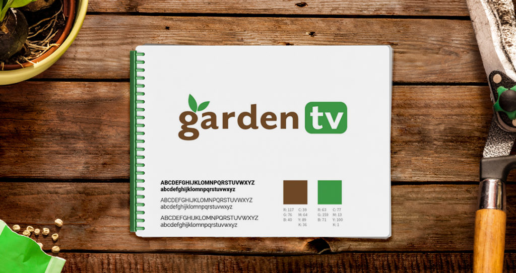
The good people at GardenTV created an online portal for written and video streaming gardening content. They needed a logo and brand identity that reflected a more modern and sophisticated network.
We found the existing logo design for GardenTV to be delicate and hard to read at small sizes. It also was missing the opportunity to represent a modern video network. We tackled these issues head on and found a high quality typeface that contained the boldness and elegance they needed to convey. We fine-tuned the letters and added a symbol for leaves and a screen to graphically communicate the network’s purpose without verbal explanation or confusion. The refinement of this brand identity gave GardenTV the flexibility to use it in more situations, and made it more memorable to their audience.


