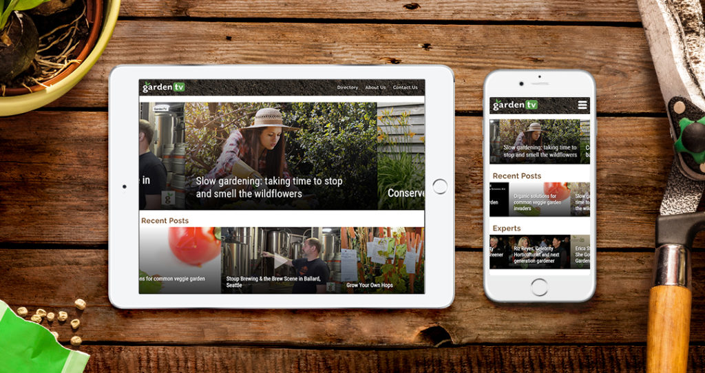
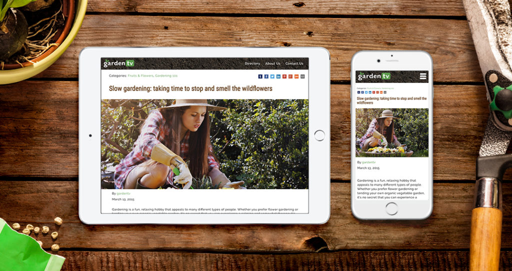
The good people at GardenTV created an online portal for written and video streaming gardening content. Their top priority was to be more accessible to their viewers by redesigning their website to be fully responsive. In addition they wanted the website to reduce distractions and be more modern and sophisticated.
GardenTV faced a dilemma. Their website was built with an off-the-shelf template that limited how much of their vast amounts of video and blog content could be viewed. On top of that, more and more of their audience viewed their website on mobile devices. To address these challenges, we drastically redesigned their site to be user-centric and responsive. By presenting users with slidable content areas separated by subject, simplifying navigation, and optimizing images and flexible layouts, we were able to make the site faster to access and easier to use. And to top it off, we cut the page load times for the website’s pages in half. The garden community can now spend more time digging dirt and less time digging for useful content.


