 3866 Views
  2 min read
If you have already started to immerse yourself in Responsive Web Design, you should check out Responsive Email Design. You might already be reaching out to your customers with email campaigns, but are you sure these emails templates display well on mobile devices ? We’ve collected a series of great email infographics to help enlighten you and your team. So here are 3 email infographics to help you get the main features and benefits of Responsive Email Design.

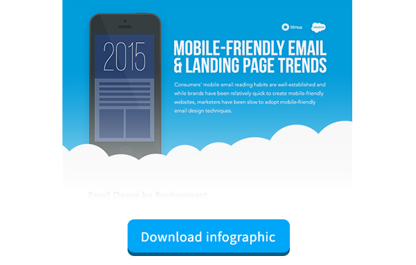
Source: https://www.salesforce.com/ & https://www.litmus.com/ |
This email infographics explains the state of mobile-friendly emails. It highlights the fact that mobile email opens are exceeding desktop and webmail. It also shows how more B2C brands are going responsive with their emails. They also give you a simple 3 step responsive email strategy. There’s a lot to do so that emails display well on mobile devices, but this infographic proves the value. |

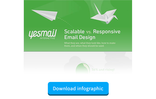
Source: http://www.yesmail.com/ |
This infographic presents two approaches to mobile-friendly emails: scalable emails and responsive emails. But more importantly, it shows problems customers are facing with emails on mobile. It defines the differences between scalable and responsive emails, and their benefits. Few companies have a mobile strategy and mastering these approaches can give you the upper hand on your competitors. |

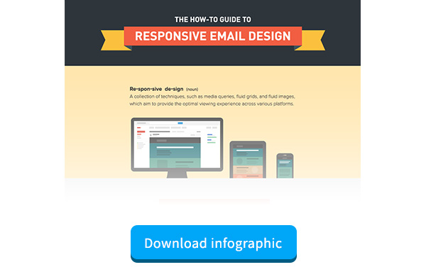
Source: https://litmus.com/ |
Here is a detailed guide to implementing Responsive Email Design. It provides key statistics, outlines features of responsive email design, and provides a how-to guide. This is great to share with the designers and developers on your team. |
Customers are engaging on mobile now more than ever, and it’s important to stay updated. Large companies like Twitter, Gilt and Monster are already using responsive emails. Old static email designs are not compatible with new customer behaviors. After all, don’t we all expect legible text and easy to tap buttons? Responsive emails are the way to go!
