The Do’s and Don’ts of Converting EdTech Customers
 Diane France
  2127 Views
  4 min read
 Share
Share Let’s put ourselves in your customer’s shoes. They might have heard of your product on Ed Tech forums or specialized websites. Your product got excellent reviews, and your lead is eager to learn more by visiting your website. What will happen if your website or your app doesn’t display well and is not user friendly? Well, you’ve likely lost that lead.
Examples of Poor Ed Tech User Experiences:
Across the board we find most Ed Tech brands struggle to engage their customers on their website. Here are a few examples that miss opportunities for converting customers:
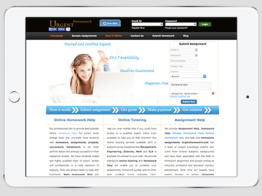
Urgent Homework
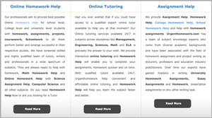
- The services are right next to each other which gives the impression that this is all one big block of text. We know there’s alot you want to say, but don’t drown your customers in an ocean of information.
|
 |
- The fonts and the colors lack coherence. The company name is written with two different fonts and there are three other fonts on the home page. Same thing for the colors with notes of blue, orange, green, black and yellow. A simpler home page is easier on the eyes, and customers will want to stay on it longer.
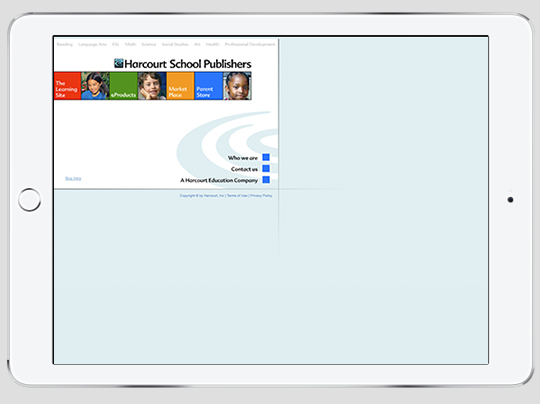
Harcourt School Publishers
- It looks outdated and not very reliable. When you arrive on the homepage, you have the choice between four main tabs. Two of them lead you to a different website and one of them leads you to a registration page. You don’t even know why you need to register! Converting visitors into potential customers requires trust that you hold the expertise they need.
- It is difficult to understand what products or services the company offers. Many pages on the website do not open correctly and the site map is confusing. You end up clicking on one of the categories to learn more. One category leads you to start a spelling game, another wants you to pay for reading eBooks. If leads can’t find the information they’re looking for, they won’t become customers.
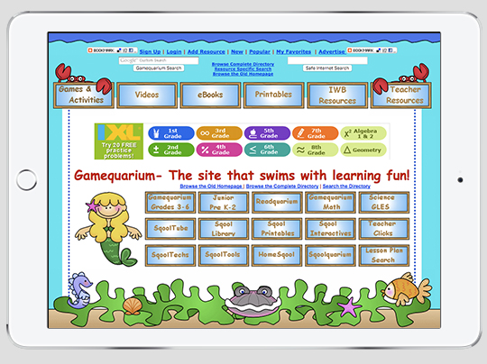
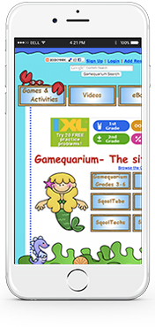
Gamequarium
-
- Navigation is too complex for their audience. The navigation on this website is very confusing and not interactive at all. It also displays a lot of ads which could be seen as a negative by parents.
- The website is not compatible with all mobile devices. More than half internet users access websites through tablets and smartphones. Imagine how many leads you could be losing if your website doesn’t properly open on these devices.
|
 |
A few shining examples of Ed Tech User Experiences:
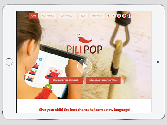
Pilipop

- Aligns with the product’s main customers. By incorporating testimonies of a parent, child and teacher, Pili Pop shows they have taken every type of user into account.
- It makes smart use of animated content. Some websites make poor use of images and videos that hinders the clarity of their content. Pili Pop masters the use of animated video to explain its technology. The video is simple but clearly shows how well the app displays on mobile devices and how interactive it is.
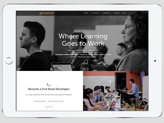
Galvanize
- A clear translation of the company’s value proposition. The home page displays many types of courses you can attend at Galvanize campuses. It gives visitors a clear idea of how Galvanize actually bridges the gap between education and industry.

- Call-to-Actions are easy to find and predominant. On the home page, the “reserve your membership” and “view courses” buttons are highlighted. After looking at the type of courses that Galvanize offers, visitors are encouraged to join its community. At the top of the home page you can easily access the phone number of customer service.
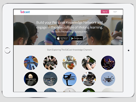
Edcast
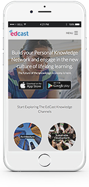
- Engages visitors with a clear offer of knowledge channels. When you arrive on the homepage you immediately get a general idea of all the channels the application allows you to both follow or enrich. It is a great way of encouraging customers to want to have access to this useful content on their phone.
- It displays well on mobile devices. It is an important feature of this website because ultimately people who download the app will want to read about any topic when they’re on the go. The fact that the website is easy to read on any device guarantees that the app will also be. Don’t forget that your website should always be as efficient as your technology.
|
 |
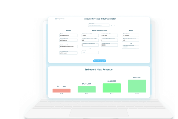
Websites that communicate better, use well designed elements, and create an engaging and mobile-friendly experiences, inspire strong relationships with customers. We hope these examples gave you a better understanding of UX Design. UX Design can increase your customer conversion rates, delight customers, and increase brand equity.
Keep an eye out for an email from us to book a your strategy session.
 1,739 views
 2127 Views
  4 min read