 16972 Views
  3 min read
We’re always talking about the amazing benefits of Advanced Responsive Web Design. (Like increasing customer retention.) In a perfect world, every website is beautiful and usable on every device imaginable. It is our pleasure to feature five seriously badass responsive websites that customers love browsing.
 website” width=”880″ height=”auto” /> website” width=”880″ height=”auto” /> |
All of the news aggregates are starting to look the same, and that’s why TNW is so refreshing to see. The website truly responsive with its adaptive layout. (Go ahead, drag the window and watch that smooth transition in wonder.) The hierarchy of each section makes reading and navigating this site extremely intuitive and simple. The simple animations on the website also make it very engaging to interact with. I could leave my mouse over the slider for days, watching the news cards ease into the carousel slider. If you have a website that distributes news, this is a good example to reach for!
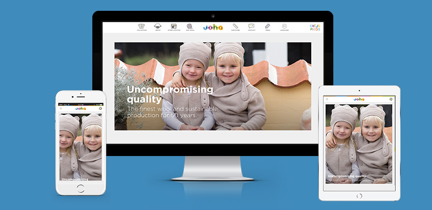 |
Number 2 is all the way from Scandinavia and it’s amazing. They play to their strengths and highlight their beautiful photography on the front page. They use fun icons to attract you to other parts of the site. If you check out the “Our Wool” page, get ready to be stunned by a killer scrolling story. The scroll is not only amazing because of the animations and how well-designed it is, but how equally amazing it is on mobile. In fact, the whole website is. You might imagine the many pop-ups and cool features wouldn’t translate well into mobile. But it does. Joha is so well-crafted that even its mobile menu adds a little charm with fade-in animations. Just be a kid for a couple of minutes and play on this site.
 |
How many times have you seen a “responsive” website that features a full-width image on the top, and three icons that collapse into giant oversized images in? Too many times? Us, too. Earth Hour shows responsive web design is more than three columns collapsing into one. (Well, mobile can’t really do anything aside from one column, but you get the idea.) Scroll down the website and see how the asymmetrical images on this layout remain consistent from desktop down to mobile. Responsive web design isn’t boring. Earth Hour’s website is a good reminder to keep things engaging and accessible.
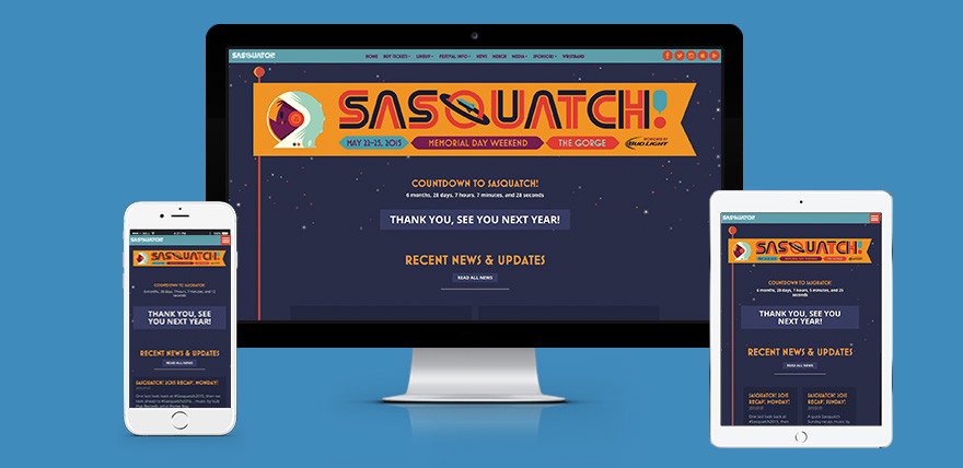 |
You know what’s a formula for a winning website? Responsive + custom type + poppin’ illustration and visual = you win. The layout for the Sasquatch! Music Festival is actually quite regular. But the visual design more than makes up its common 2-column into 1-column grids. But enough about the eye-catching imagery, this is a list for responsive web design after all. Pay attention to how quick the page loads, yet all the images are always crisp no matter how large it’s scaled. Too often we see websites throwing a 100% width around an image and let become pixelated and unsightly.
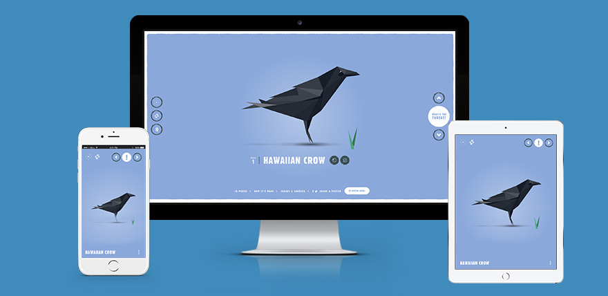 |
I don’t even know where to start. Just click it, for the love of Responsive Gods. Click on the link and bask in all of its responsive glory! We hope that you enjoyed this list of absolutely delightful advanced responsive websites. You’re probably itching to get your website on par with these responsive gems. Even though they are extremely complex and difficult to achieve, they are not impossible feats of achievement. (Except Species in Pieces, I’m still watching the sublime transitions between each animal.) All the tricks and techniques work to increase customer retention and are part of the Responsify toolbox. And we are beyond excited to build them into your projects. Do you know a website that trumps the ones above? Or do you feel that one of these websites doesn’t deserve to be on this list? Feel free to contact us and voice your thoughts!
