
 new post
 Brendan Lam
  454 Views
  4 min read
 Share
Share Attracting leads and keeping customers on your site is a competition. It’s a constant face-off between websites striving to outreach the other with engaging content and great user experiences. While good responsive websites have the potential to attract a few leads and keep them, great websites are champions at maximizing their lead generation and keep customers coming back with advanced responsive design. If your website is only getting a bronze and struggling with attracting returning customers; don’t worry, there’s always room for improvement to get the gold.
Here are some of the things that make champion responsive websites, and what you can work on to get to the top:
Bronze- and silver-level responsive websites think that slapping on some code that makes content sections span across the entire page width in chunky blocks is engaging to customers. Gold-level websites understand that space is an important resource to manage. They prioritize and plan how much content goes on the home page and how much space content deserves. Customers are leaving websites quickly, so you have to make sure that you give them what they want right off the bat, since most of your customers aren’t scrolling down to the bottom of your website.
Bronze-level responsive websites may look decent on a couple of devices, but advanced responsive champions perform at their best regardless of device dimensions. Basic responsive websites usually look good in desktop view and perform decently in mobile, but medium sized screens layout transitions expose poor spacing and scale. (We think of this as the awkward teenage phase of responsive websites.) Make sure that your website is consistent on all browsers and looking its best on every occasion.
You know what’s not engaging? Templates. Responsive web design is catching on and businesses are trying to find quick fixes to stay up-to-date with new mobile browsing habits. But let the Responsify-sensei impart a bit of wisdom to you: customers can sense a template from a mile away. Make sure that your website is dynamic and engaging by staying away from templated work. After all, if you walked into a store would you prefer to be greeted personally or to be handed a pre-written message?
Responsive web design is supposed to be easy to navigate. That’s practically the whole point. Yet often we see mobile websites putting their navigation awkwardly at the top with tiny little links spread across the width, making it unappealing for your customers to navigate. For websites utilizing the “hamburger” menu, they often pack it with so many things that it just becomes too overwhelming and convoluted. Gold-level responsive websites consider all aspects of navigation, and not just the bar at the top. Gold responsive websites are easy to get from one section to the next without hassles like scrolling down for hours or clicking through multiple pages to get somewhere.
After covering some of the qualities that make responsive web design champions, here are some examples that will help you to discern what each tier looks like and where you might place in the race.
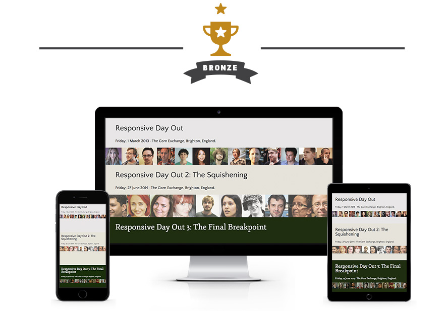
You know them well, these are the websites that are hard to navigate on mobile interfaces. Regardless of how well-designed or engaging a website is, if it doesn’t work on mobile then they’ll be stuck in with a bronze. Bronze responsive websites are extremely basic in terms of how responsive they are. Spacing will be inconsistent, type will not be optimized across all the device sizes, and images will scale but leave awkward gaps or will be pixelated on larger screen sizes.
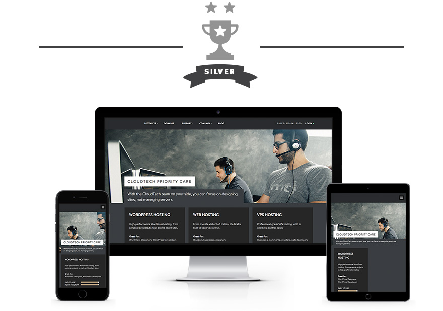
Websites that belong in the silver tier look decent on desktop and passable on mobile, but often forget medium tablet sizes. The most telltale sign of silver level responsive websites are templated layouts, and they are often only optimized to snap into two or three breakpoints without true adaptable or fluid scaling.
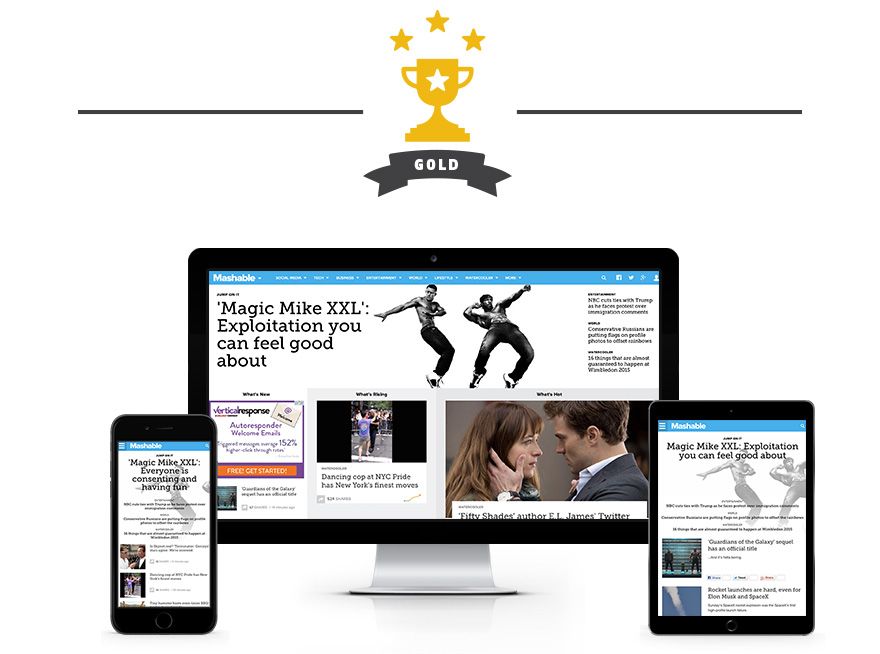
Drum roll please. Prepare yourself for the crane kick of advanced responsive website examples. The champion level Advanced Responsive Websites give you all of the information that you are looking for immediately by strategically placing their content in engaging custom layouts. These websites never miss a beat when you’re stretching or shrinking the window size; they look great on all browsers. It’s always easy to flip through pages on these websites, and they’re consistently engaging no matter where you end up.
We’ve given you goals to accomplish and examples to follow, so now it’s time to put on the training gear and get your website to the top. Don’t forget to stay hydrated and get help from a trainer if you need it!
Want more actionable steps to becoming responsive customer retaining champions? Check out our Responsive Web Design Tipsheet and get a jumpstart to your journey to the top!
 More informative content