Anna Kuser
  4137 Views
  3 min read
 Share
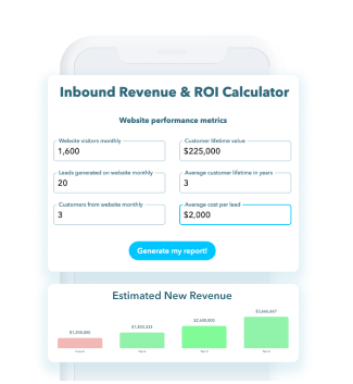
Share Here are 5 case studies of websites that have set the bar for increased conversion rates with user interface design. As a reminder, conversion refers to the marketing goal that you aim to achieve. Sometimes a website’s goal is to gain newsletter subscriptions and sometimes it’s getting a button clicks. Without further ado, let’s examine some great sites that have utilized effective UI & UX techniques.
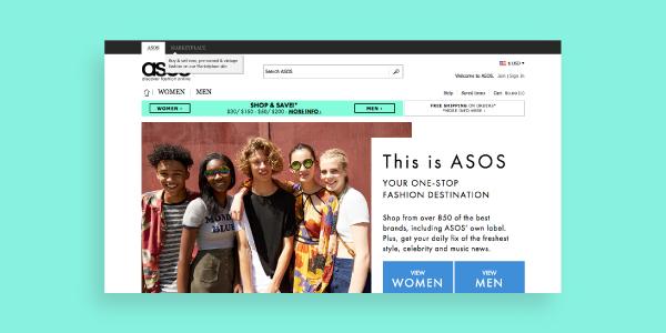 |
For you online shopping mavens out there, you’ll appreciate the tactic that popular clothing retailer ASOS took. ASOS noticed a high abandoned shopping cart rate on their website and wanted to turn more browsing customers into buyers. So how did they reduce their cart abandonment rate and turned more leads into customers? ASOS removed a mandatory registration-before-purchasing interface, and replaced it with a simple “New to ASOS? Continue” button. This new button lead customers through a quick and easy account creation. But there’s more! ASOS stripped their registration down to just the essentials; such as name, email address, and password. The checkout experience now felt less arduously invasive and more carefree. The new changes led to cutting their former cart abandonment rate in half!
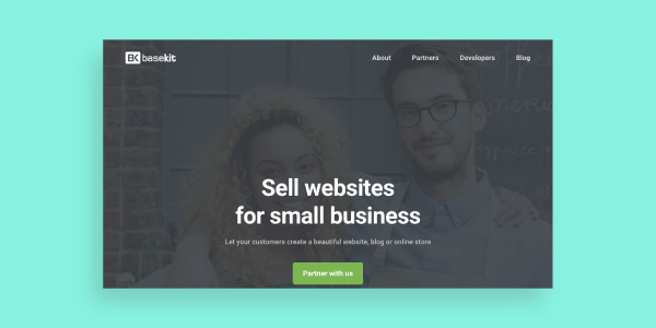 |
Website building service BaseKit increased their site conversions by 25% after A/B testing their “plans and pricing” page. Their goal was to increase the amount of users who would click on the “buy it now” button after visiting the company pricing page. They found that including things like testimonials and more details on the packages, increased their revenue by 274%. One of their key findings was crucial information on the pricing page did not have to live above the fold of the page to be informative. In contrast to most page designs, the pricing plan page that had more organized call-to-actions received more meaningful traction.
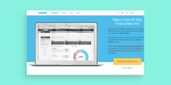 |
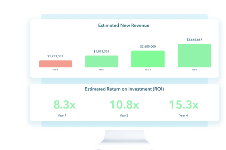
Moz marketing company shot ahead with a 52% increase in sales of their PRO membership with a survey. They surveyed current and former users to understand how to improve their services. The survey included a free 30-day trial membership for only one dollar with participation. (We’re sure that the incentive went a long way in enticing members to sample their full suite of services after taking part in the survey.) Four months of consistent email support follow-up afterwards led to a 170% conversion and more than $1m in additional revenue!
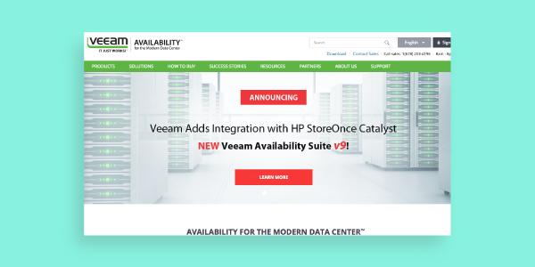 |
Anyone with experience as a writer will know that word choice can make or break a campaign. Software company Veeam changed a word in their navigation and received an increase of 161% on their click-throughs. Veam’s website serves as a portal for partnering software products. Their product information page features links to their partner websites and pricing pages. Veeam’s goal was to take users to these partnered websites. When they replaced “Request a quote” with “Request pricing” on their navigation, they saw an impressive increase in click-through rates from 0.54% to 1.40%. Who knew one word could be worth so much?
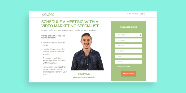 |
Responsive websites typically flourish without hosting big flashy videos on their landing pages. So it’s expected when Vidyard saw a 100% increase in landing page conversion rates when they embedded a new video on their page. This is a reminder that there’s no one-size-fits-all approach to responsive website design. So it’s all the more important to consider your customer needs and test variations.
With these successful examples, we hope you can add value to your business by increasing conversion rates with usability!